Hasegawa/Revell 1/32 Focke-Wulf Fw190D-9
By Tony Oliver
You can almost hear the collective groan of 'oh no not another one-ninety'. But I make no apologies, I like them, in fact I have an 'on-off' obsession with Tank's design which sometimes approaches levels that could be thought of as almost un-natural (OK so maybe it's not so weird to have 10 copies of one kit in the cupboard, and I bet a certain Mr Sherland probably has half the world's remaining P-47 output in his hobby room…).
Still it seems I'm not alone and whilst the modelling world isn't creaking under the weight of 190s in quite the same way as it does with all those 109Gs there's always room for one more.
There's enough written both about the aircraft and the kit already that doesn't bear repetition here so cutting to the chase, I built this kit with the goal of extending my finishing skills and to explore the variations of the late war Luftwaffe camouflage schemes after reading an article by David E. Brown.
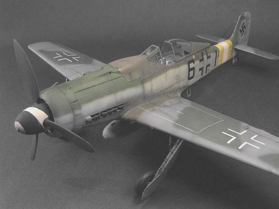
The great thing about the closing stages of the air war in Europe is the colour diversity of subjects. Of course there is surviving documentation along with plenty of supporting evidence that has allowed researchers and historians to build a good picture of what were probable schemes and the use of colour at unit levels. But the chaotic conditions which saw combat units move location sometimes on a daily basis, means that records are thin on the ground for many specific aircraft and this frees the modeller to be a little more creative and interpret some of these schemes from an alternative viewpoint.
Totally Illogical Captain…
The starting point for modelling Black 6 was the EC58 decal sheet from Eagle Editions and to build one of the so far sparsely documented 'large tail' Dora-9s from the 500xxx werknummer series.
Imagine my surprise when I discovered that not only does the Revell (Germany) kit include Black 6 Wnr. 500645 in their kit decal sheet, but also the other better known large tailed 190, Brown 4 Wnr. 500647.
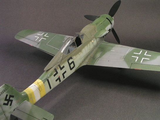
Actually Brown 4 is rather better documented and images exist of it in a semi derelict state in a revetment at Husteldt on the North German Plain in the spring of 1945. The two published images are on the face of it, one in the same aircraft but on close inspection there are several basic differences, which suggest two separate aircraft, but that's another matter. This in itself further supports the idea that there were several aircraft constructed/modified with the larger metal or wooden Ta152 type tail.
Whether the tail swap was done at initial construction or was a field conversion due to battle damage is still a subject of conjecture. Unfortunately the images supporting Black 6 are rather less complete and really only prove the existence of the airframe by the remains of the damaged tail with the werknummer 500645, that has been partially over painted.
Eagle Editions excellent colour instruction sheet (EC58) mentions the existence of a colour image of Black 6 but the sheet doesn't identify where or when it was published. After strenuous efforts to track down this image, which incidentally is also called out on E.Brown Ryle's limited run 48th Kommandeur scale decal sheet, I gave up discovering only that it was reputedly published in a book of French origin.
I decided that it would be more interesting to revise the colour scheme using a collection of supporting evidence on how 190D's in general were constructed and component sub assemblies finished prior to final construction and delivery.
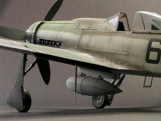
There are pictures of Fw190's in various states of assembly to provide evidence that it is quite possible for a variety of colours and demarcation patterns to appear on one aircraft. Add to this the field alterations and what starts out as a simple matter of painting a standard scheme turns into something more akin to alchemy. Which is great from my point of view as both artistic and modelling licence can be given a bit more elbow room.
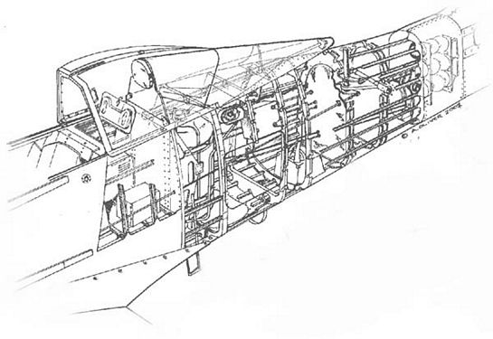
Detailing this kit was kept to a minimum and I resisted the urge to include one of the superb cockpit sets available along with many of the other embellishments that are rapidly appearing for the 190. I did however correct the gun hood profile with Milliput after seeing Jerry Crandall's replacement item. After a bit of correspondence here on LSP, I decided that this was one aspect of the kit that really did need correction, the kit hood having a look of being 'silicone enhanced' (another obsession altogether…) The only other additions were the harness from scalpel blade foil packaging, textured with the knurled grip of an old needle file completed with an old set of brass-etched buckles and those rivets….
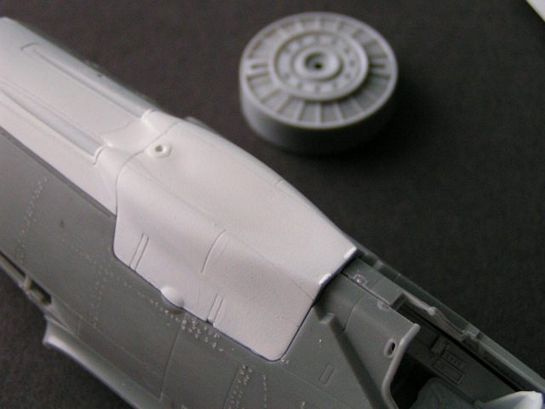
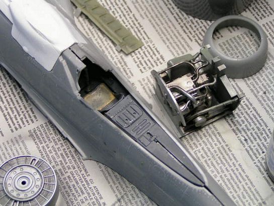
Why oh why did I do this? I'm not entirely sure if after the paint and lacquer coats, it wasn't a gigantic waste of time but at least I can say I actually completed the entire airframe. The pattern is an approximation and many of the lesser rib and stringer patterns were left off, if only for the sake of sanity and my eyesight.
Any colour you like as long as its Blaugrun…
The logic behind deviating from the instruction sheet is based on the knowledge that the main components were assembled in dispersed factories, finished to an RLM specification intended for the specific aircraft type (Oberflaschenshutzliste, or Os-Liste). These documents were issued by both the RLM and aircraft companies with RLM approval. Overarching documents issued by the RLM were Sammelmitteilungen and these were more detailed in the use and replacement of colour based around general use of replacement colours.
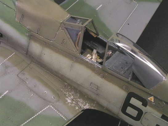
These directives applied to all aspects of the aircraft's finish. The article by David Brown that was published some years ago on HyperScale delves deeply into these documents and the implications they have on the perceptions of late war schemes. After reading this absorbing article it was enough for me to assume the possibility that instead of a uniform finish, different components could have received different colour application based on a combination of outdated directives, the production of approximate colours for expediency or a combination of poorly applied primer and paint. Indeed its also possible that paint manufacturers faced with the changes required by the RLM, used modified existing paint stocks. As it is stated clearly in one Os-Liste from the RLM that if considerable stocks of paint were available then they should be used up or traded to other manufacturers for use. To add confusion it is apparent that several Os-Liste existed at any one time for a specific aircraft type, giving the aircraft manufacturer even more scope for misinterpretation.
The quality and application of the primer and paints would further add to the possibility of deviation from the long established 'standard' colours. In my opinion this all provides the modeller with the incredible opportunity to be diverse and inventive with aircraft where there is a distinct lack of hard evidence. As always if anyone knows different and has evidence I'd love to hear from them. Its time we started to think 'outside the box'.
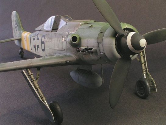
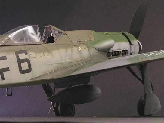
Brown 4 has been a popular subject for modellers before in different scales and in particular Mark Tucker's quarter scale Dragon D12 conversion was a good starting point for applying this aircraft's colour characteristics to Black 6. In fact there exists different interpretation of this aircraft too and Claes Sundin, the well known profile artist published a profile of Brown 4 that mirrors the overall graugrun scheme as depicted on the Eagle Editions EC58 sheet for Black 6. Whilst Brown Rhyll's Kommandeur decal sheet interprets the scheme with a more fragmented 76/ Graugrun fuselage scheme, the scheme that Mark opted for and the style that I've adapted to Black 6.
I think the images describe what I tried to achieve so I won't bore you with numbers and the vagaries of the erroneously labelled Farbton 84. If you have an interest do have a look at David's article for a considered opinion on the four known shades of this colour.
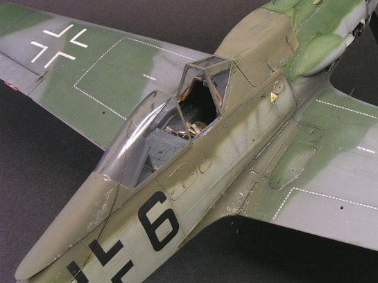
Suffice to say I decided to add a touch of 76 in a bid to make it look as if the fuselage colour was a variation of the 'neat' 76 applied to the tail and forward fuselage and not a separate colour in its own right. If I'd been really keen I would have altered the tonal value of the 76 on the tail to suggest that the makers used a different mix here also, but this was perhaps going a bit too far.
All the colours were from my dwindling Aeromaster acrylic stocks (neatly mirroring the true events of 1944-45) and thinned with tap water to a milky consistency. I can't quote ratios as I tend to airbrush 'on the hoof', and change paint consistency as I change air pressure. I know that tap water isn't supposed to be used with this paint, but I've never had any problems so far and I do live in a part of the world which is fortunate enough to have good quality water…(it rains a lot)
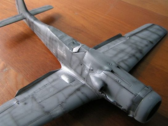
I spray at a low pressure requiring a thinner mix but this allows me to work close to the model to do demarcations freehand. There is virtually no overspray but I do use some masking where there is a big tonal contrast between colours such as wing root to fuselage join. Other markings such as the yellow white yellow RVG bands were sprayed and masked in logical order, as was the spinner. It received a coat of Tamiya acrylic white tinted with a bit of RLM66 to kill the starkness and then masked with a hand-cut spiral and the Humbrol coal black sprayed over.
I almost forgot to mention, the under surface was Alclad II aluminium shade A, which is in keeping with various Os-Liste requirements. I believe the 'wrap-around' use of 75 Grauviolett on the wing leading edges and landing gear covers was an attempt at unit level to make the aircraft a bit less visible to low level recon and airfield attack, so I used a fresher mix sprayed over the weathered splinter pattern already applied. Its not too apparent from the images due to my editing them for gamma correction/ tonal contrast.
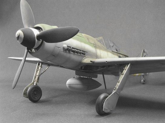
Eagle Editions decals are well known for their product quality and attention to detail so there's no need to bang on about how good they went on, save for the fact that after correspondence with David E Brown, I deviated from the suggested national markings and replaced the fuselage balkenkreuz with the larger B4 800mm 'open' basic crosses. I also replaced the underwing markings with the same B4 900mm crosses, reasoning that these markings were commonly seen on the same aircraft.
Without the evidence of the colour image of Black 6 to validate the instructions, I went with a crop of supporting images and correspondence on the 500xxx werknummer information. Again this is purely personal preference and if anyone can help out with further information, I would like to hear from you.
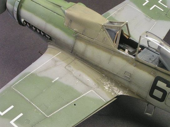
After a coat of matt acrylic lacquer (this stuff always dries too quickly in my airbrush for some reason!), I headed into final construction territory adding the aerials, canopy, which incidentally was so nice out of the box I didn't bother to give it the Johnson treatment, and the slackened radio aerial. This was giving me a headache and I eventually persevered with a single strand of copper wire using Humbrol Clearfix for the insulator blobs. Scuffs and scratches were added with a Derwent silver artists pencil and combined with scraped back Alclad II in strategic areas. I also discovered that it's so easy to go from 'just right' to 'overdone' in a few small marks…
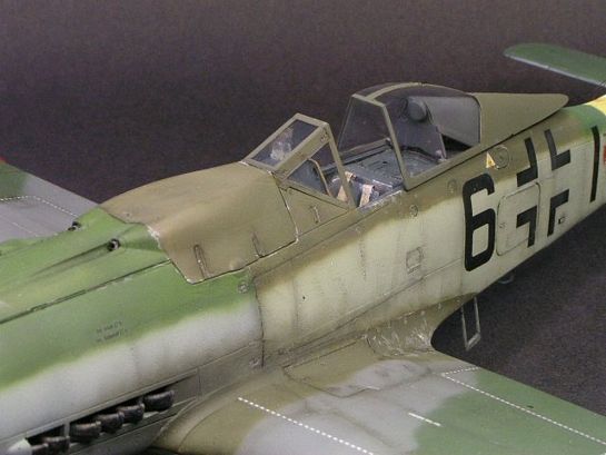
The panel shading was a combination of post and pre shading inspired by the incredible painting skills of Andrew Dextras and highlighted with a wash of heavily thinned illustrators ink into the access panels and a less obvious wash of thinned acrylic 'grime' (a mix of Tamiya smoke, Aeromaster black and a bit of brown acrylic tube paint) on areas of heavy traffic. I believe in trying to avoid a uniformity of finish with washes and detail painting. So I avoid running this mix into every panel line and concentrate on areas of natural shadow or areas where dirt would accumulate. Remember these aircraft were fighting for their existence and by this stage of the game cleaning anything but the canopy was very low on the duty list.
Say Cheese…
Photographing the model also explored new areas for me and whilst I've been doing outdoor landscape photography since I got my first Zenith 1 on my Eleventh birthday, I've never really explored indoor photography with its special lighting requirements. I intend to research the art of a well lit model portrait further, but I managed to set up a makeshift studio with a piece of black sugar paper for the neutral background.
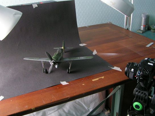
The lighting was a combination of my fluorescent dentists magnifier and an angle-poise desk lamp fitted with a 60watt daylight bulb. These are blue and change the colour 'temperature' to something approaching that of natural daylight. The whole set-up is placed next to a north-facing window, which has voile curtain hanging in it to help filter harsh direct light. The Minolta Z1 digital camera was mounted on a 'borrowed' tripod designed for AV movie cameras and was essential for the next step.
I never use the auto exposure setting on either of my cameras, because the metering system can be fooled but mainly because using either aperture or shutter priority gives greater control over the final image. Perhaps aperture priority is the easiest to manipulate and for maximum depth of field an aperture of f8 or greater is needed. This all means that a small amount of light is entering the camera and this in turn controls the shutter speed. With f8 the shutter speed drops to 1/15th of a second, (to allow for the correlation between shutter speed and exposure) hence the need for a sturdy tripod and ideally a remote way of releasing the shutter. Of course all cameras differ in respect of capability (usually with a price tag to match) and it maybe that yours is capable of f22 or even f32, which means that shutter speeds of 1 or 2 seconds or greater are possible along with a greater depth of field and greater reality. Anyway don't rely on the auto and give it a go and experiment with light positioning, camera angles and exposures.
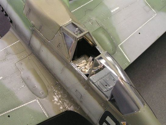
Finally the images were post edited using Adobe Photoshop Elements and JASC's Paintshop Pro 8 for gamma correction and contrast. PSP8 is useful for editing out dust spots on transparencies and making the whole thing look way better than it does in real life!
The whole subjective issue of the 'late war greens' ensures plenty of modelling subject matter for Luftwaffe fans for years to come and I must stress that the final product is only my personal take on what might have been.
All of the published profiles and decal sheets have an equal claim to authenticity based on available references, research and just a bit of educated guesswork and it would be quite wrong to suggest that any one scheme or profile represents the definitive. Perhaps, due to the fog of war, we'll never know for sure. Now to find that colour image of Black 6, the Holy Grail perhaps?
References
- The official Monogram painting guide to German Aircraft 1939-45: Merrick & Hitchcock
- German Aircraft Markings 1939-45: K Merrick
- JG26 photographic history of the Luftwaffe's top guns: D Caldwell
- Defeat in the West 1943 the Luftwaffe at war series: M Spick
- Fw 190D & Ta 152: JaPo
- Yellow 10 Eagle Files 2: J Crandall
- Aero Detail 2 Fw 190D
- Internet articles that I can remember:
- Late War Luftwaffe fighter Camouflage Pt3: D E Brown
- Late War Luftwaffe fighter Camouflage Pt5: B Green/ C Swank
- Fw 190D-9 Brown 4: M L Tucker
- And a host of illustrations and images from various publications and web sites.
© Tony Oliver 2004
This article was published on Wednesday, July 20 2011; Last modified on Saturday, May 14 2016
